A new poster has hit the net for Rob Zombie’s Halloween sequel H2.
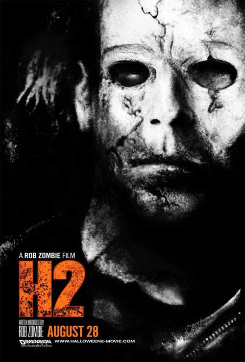
I like the gritty darkness of the poster and the black and white illustration style. Doesn’t make me all juicy to see the film, but it is a striking image.
Share this Story
A new poster has hit the net for Rob Zombie’s Halloween sequel H2.
I like the gritty darkness of the poster and the black and white illustration style. Doesn’t make me all juicy to see the film, but it is a striking image.


Ryan Reynolds coudln’t fully park the snark for ...


