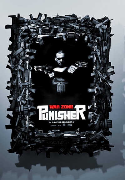
I actually think the gun frame idea in this poster is a good one. I just wish they removed the grey around the frame. We get the following hook up from our friends at the movieweb:
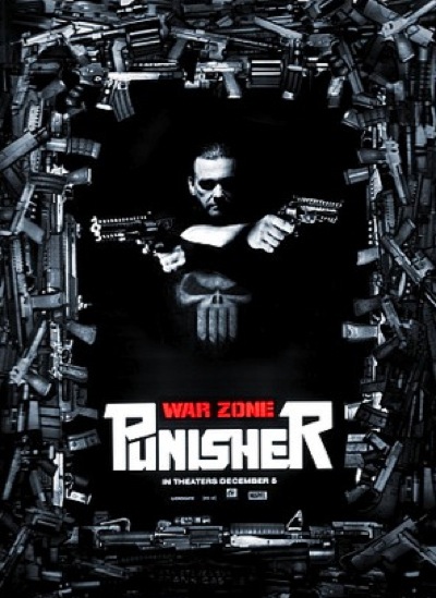
Here is what I prefer
What do you guys think?
Comment with Facebook
I actually think the gun frame idea in this poster is a good one. I just wish they removed the grey around the frame. We get the following hook up from our friends at the movieweb:
Here is what I prefer
What do you guys think?


You must be logged in to post a comment.
Screw this movie
Yeah I think you guys have totally missed the boat. I think this is a photo of the poster in an actual frame – the gray is the wall. If the poster is displayed this way in theaters – in a frame of guns, then it is pretty cool, unusual and would grab an enormous amount of attention.
seems to me you like the 80’s :P…. either way the poster looks bad, but like the idea
What Spenser said. However….
it doesn’t hold a candle to the 2003 Bradstreet campaign, much less the early posters of that film. I think this film is being handled like disposable wipes. Clean your hands, then toss it in the trash.
I don’t think the gray is actually part of the poster. I think it’s one of those 3-dimensional posters and the gun frame will literally look like a crapload of guns piled around the poster. I could be wrong, but I’m noticing the shadow on the gray and think that the gray was just a background with which to show that the poster was 3D.
If that’s the case, I think it’s a good job.
If the flat grey background had texture, like rusted metal or just grain, I would like it more.
How do you get a job in movie marketing? These guys are hacks!!
the bottom Poster is waaaaay better. How come you guys are always right?
i know i think the part where he shoots the guy in the face while holding a baby is over the top awsome lol
@HAZMAT_DRINKS_BLOOD
now thats what im talking about.
blood = paid in full.
this would look great as one of those cut out cardboard posters at the theaters
LEELOO
http://www.youtube.com/watch?v=wkxLWWiz5O8
punisher= blood!
one drop of blood would say more than all those clean shiny guns.
Meh. Poster isn’t as good as the past ones, but is better than the original teaser one. Wishy washy at best.
Still, Batman, Punisher, and Daredevil are my favourite heroes… so, I have to see the movie and hope that it is something that doesn’t let me down.
hazmat likes the part where hes dangling from a rope with 2 machine guns firing at multiple people who were just eating dinner.
but thats after he lands on the table and stabs the old guy in the cranium with the spoon giving him a whale nose
the fat ladys head exploding was also fun
looks good the way they did it cuz you can see the gun outline witch is cool.
i think this poster looks awfull but the 2nd trailer (which you guys mysteriously did not see/post up) was freaking awesome and it shows how gory/violent the movie will be. it was great and the action looks amazing
which is what i expect out of this film. not a twist ending awsome action/drama that will win oscars
i just cant get over the punisher stabbbing a guy in the eye with a chair or jigsaw sinking that broken beer bottle in that guys throat…cant wait
Are we sure the grey is how it looks in real life? or just how it was posted on the internet? If it IS the way it is supposed to be, then they fail.
otherwise if it is as you have it, or better yet, Diecut style, awesome. still will pass on the movie though.
Can’t say I’m crazy about it either way.The first one, they have a cool idea (framed picture with guns as the frame) that is poorly executed. Especially since the grey wall looks like a photoshop gradient. The revised is better, but less ambitious and more generic.