They just released the first poster for the upcoming “The Soloist” movie with Robert Downey Jr. and Jamie Foxx. My friend Kris Tapley over at InContention.com put up an interesting little image showing just how overdone this sort of poster is.
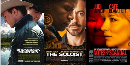
Here are some more with that whole one face behind another look to them:

Now let’s be fair, there is only so much you can do with a poster and with thousands upon thousands of them being produced and created each year it is hard to be “original”. But this two faces style seems to be really over done.
Aside from the ones in the image above, what other movie poster can you think of that use this style as well. I’m thinking “Face/Off”.
Comment with Facebook


Where’s Titanic? This is Madness!
Thank you for a nice collection of colorful posters.
One of my favorite posters is for a classic 1970’s movie called the “Endless Summer.”
I noticed that nobody has mentioned “Conan: the Barbarian” yet.
Most of those Paramount titles (Enemy At the Gates, Rules of Engagement) were done at/by BLT. A haven for talented artists run by tyrants.
It’s overdone for a reason… and that reason is because it works! Having the main actors appear on the poster is an awesome way of marketing.
Batman Returns did it (although with 3 faces) but did it quite well.
You usually get this sort of thing for the video store covers while the ‘normal’ poster can be a lot better. The cinema poster for Enemy at the Gates was a lot better (http://i30.photobucket.com/albums/c304/jmcc2/enemy_at_the_gates_ver1.jpg). The Sum of all Fears one was also different although not much better (http://www.impawards.com/2002/sum_of_all_fears.html).
I suppose they have to try and show off the leads in video stores to grab the attention of casual browsers although, in my own case, I’d be more intrigued by something less obvious.
Titanic, does practical magic (Bullock and Kidman) fall in this category too?
Blame the agents. Actors have clauses in their contract that dictate how large their head will be in relation to any other actor. Add to the fact that actors “sell” a film so they need to make sure everyone knows. Movie posters are marketing, not art.
The Patriot and Gangs of New York use it as well.
Seven, Bride of Chucky, Along came a Spider , Flock, Sleepy Hollow, Fight club, Fracture, The prestige, Speed 2, A Righteous Kill, And the Brothers Grimm to name a few more.
john its about marketing
phil gee, i don’t think it’s lack of talent at all. i think these designers/artists are at the mercy of studio execs, stars etc. that demand the heads of these stars be the selling point of the movies. look at the teaser posters and independent films, they don’t use “the head” scheme (as much:).
I love how all the posters they look like they should kiss but in broke back mountain there not looking like there going to kiss.
I like head(s).
I am makig my own movie poster just for fun and I will try to avoid these for inspiration.
You know, I think I want to watch Reign of Fire again.
Best death scene ever.
face off and broken arrow
Titanic, Saving Private Ryan, Transformers
reign of fire
wel…face off they were facing the camera…does AVP one and two count?
and freddy vs jason?
someone beat me to “war” already…
transformers has a poster with megatron and optimus doing the face off thing…
At least it’s better than those rom-com posters of the leads standing back to back giving each other “quirky” looks. Or anything in front of a white background. I’m fine with the face to face posters since they at least look interesting, but the white background posters need to shrivel up and never come back.
Dead End speaks the truth. If you remember, John this was something i talked about the very first time i called into the show on Nowlive. We just seem to be lacking the talent and originality in movie posters these days.
I’ve seen plenty of good looking posters, even some gorgeous ones in the last few years but practically none that stand up to the standards of the 70’s & 80’s.
What about “Space Cowboys” with Clint Eastwood, Tommy Lee Jones, Donald Sutherland, and James Garner? Or is that too many faces?
Rather creepy looking actually. Robert Downey Jr’s face looks really out of place. It would of been better if it just had Jamie Fox’s face on there and the rest of the post black or something. But they gotta play up both actors of course (especially since there is oscar talk for Downey…isn’t there?).
War
Titanic, Demolition Man, Double Team
Movie posters used to be works of art that worked hard to capture the tone, atmosphere and essence of a film. Now, they’re this:
http://www.funnyordie.com/videos/47d8df4123