My Name Is Bruce Posters

Good Morning children of the earth! Rise and shine to the glory of Bruce! Two posters have been forged for the upcoming film My Name Is Bruce; they have been made available to us thanks to our friends at moviesonline:

Bruceo1

Bruceo2

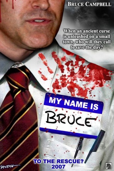
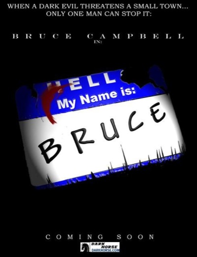
These posters are enjoyable enough, but I certainly hope we have something more like the classic Army Of Darkness poster as the film nears release. There is something about a painter poster where a man is battling a Chinese War God that really turns my crank. What do you guys think? Would hang these posters on your wall, or will you wait for another?

Comment with Facebook

7 thoughts on “My Name Is Bruce Posters

  1. The movie looks amusing but wow…those posters are god aweful. Look at the type in the first poster. My lord that is bad. First day of typography class…never use drop shadows behind text. Both posters have pretty bad type. As for the first poster, the pictures are terrible too. It looks like a bad photo of Bruce was used. It’s all blury. The nametag looks pasted on…not even remotely being disturbed by the wrinkles of the shirt. The blood is just bad…very bad…as well as the grey sky.

    Okay the graphic designer in me a bit. The movie looks funny, guess that is all that matters.

  2. I think the idea behind these poster is amusing, but they seem pretty poorly executed, like someone who just learned how to use photoshop slapped it together.

    Honestly.

    Still look forward to the film though.

Leave a Reply