A new poster for Streetfigher: The Legend of Chun-Li has been released and the graphic designer in me weeps.
After so many photoshopped floating head posters, you would think that every designer worth Hollywood’s note would dodge that cliche.
I like the direction they are going with the franchise (anything would be better than the VanDamme flick) But this poster is NOT inspiring me.
Comment with Facebook


Unless you are suggesting that the JCVD Streetfighter was SO bad that it unintentionally becomes amusingly funny… no.
Nothing can be that bad. The badguys are bumbling clowns, Bison was about 150lbs, and Cammie was played by Kylie Minogue. People have a hard enough time believing Kruek as a combatant, but 86lb 4’10” Kylie Minogue is ok?
In order to overlook the flaws of that movie, you have to not watch it.
Nothing will beat Van Damme Street Fighter.
Nothing!
This could never ever be better than that one.
Rodney, you are wrong.
Why is Citizen Kane the example you have to turn to? If Dragonball was anything like Citizen Kane it would be stupid.
If you are going to make a parallel to a quality movie then use an example that is like the genre you are comparing.
Rodney: I was speaking in terms of the general populus when calling you idiots, no one in specific.
SPEED RACER is an excellent adaptation of the anime and the way it should be done and it was totally ignored by the general public, so if people want to complain about bad anime films then they can only have themselves to blame for not getting behind SPEED RACER.
Trailers are made to give a general impression of the film. Maybe every other shot DRAGONBALL is like CITIZEN KANE and they only showed the bad bits, but at the moment I’m say it (and CHUN LI) are rubbish.
@Keneda979
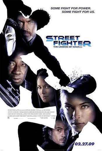
That is Vega in shadow (mask gives him away), and the arm visible is his left arm. His claw is on his right.
Wow, this is total crap.
It’s mostly just a poster with some actors faces. If it wasn’t for the dude wearing the mask, which is of corse Vega, and the really small and REALLY uncreative new Street Fighter movie logo, you would have no idea what the hell it was for. I hardly even knowdest the 2 fighters in the background, which are also really shitty looking.
I don’t really know how to use photo shop that much, but I think even I could of done better. I don’t wanna see just faces and black shadows of a badly drawn fight. And is that Vega fighting as one of the “Shadows”? If it is, where the fuck are his claws?! Dosen’t he fight with his claws on his right hand?
Ya, I don’t wanna see this crap. Hopfully they’ll come out with full single character posters a little bit later. I wanna see Vega, Bison, and Chun-Li in full costume, maybe with there hands glowing with power, or cool, full on freeze frame fights with them throwing there trade mark energy attacks done with some great effects. Come on now, if they wanna make any money off this movie at all then they really need to try ALLOT harder.
Speed Racer was the worst pile of crap ever
Speed Racer is good. OMFG have you seen the Blu-Ray?
@FinalJoe
You Idiots?
John didn’t like it at all, I thought it was ok. Lets not jump to conclusions here FinalJoe. It was heavily stylized so I could see how people might not care for it. My kids loved it and that was the target demographic anyways. I didn’t mind it.
And again, you might not like the trailers for this or Dragonball, but you haven’t seen the movies yet (no one has) so you just jump to more conclusions calling it rubbish.
Utter shit. Doesn’t evoke any of the iconography of the series.
Hollywood will never do an anime film right.
Oh wait, it did SPEED RACER, but you idiots pissed on it and now all we get is Z-grade rubbish like this and DRAGONBALL.
that tagline is awful, i dont know if the film will be any good but apart from the name i wouldnt have known it was a street fighter film if it wasnt for the name. Being a massive fan i think its a massive insult. also I think kristina (or whoever) is a bad choice for chun li, beautiful as she is she doesnt seem to pack a punch. lame in my opinion do a Awesome CGI film on the life of akuma and you could make him exactly as he does in the game and comics.
It’s an nice design but fails at pointing towards the main character.
Designers have no say in how the final product will be, it’s all up to the marketing department.
In America floating heads sell the picture, doesn’t seem to be the case anywhere else, although it does happen.
none of those little faces evoke the feel of the iconic street fighter characters, its just some people.
this sucks. just a simple shot of chun-li in her costume doing the special move would do it for me. hehehehe
But that “some guy” still isn’t Chun-Li … you know, the legendary figure upon which this movie is based?
Just sayin.
i do like how all the floating heads are inside some guy punching somone but it’s till floating heads
OK, the poster looks really lame and thats ok cause the film look just as lame. None of the characters look reconizable to there game counter parts so how is anyone to know from a distance this poster is for a new Street Fighter. Also I like to debate on the fact that the producers really cared about the project. They didnt even have the nerve to even put in Ken and Ryu in the film. They are the main characters of the freakin franchise! Why does hollywood diss them, first we had the Guile movie version and now we have the Chun-li version. This really isnt a hard concept to adapt when you take out the fireballs and psycho crushers. This should be a movie like Kung-Fu meets Best of the Best meets Roadhouse meets Mortal Kombat. Also the last actress was way better as Chun-li check out this site….
http://whysoseriousgamers.wordpress.com/
@BigSampson, I disagree. You might laugh at them, but I am sure that the producers of this movie felt they were doing the right thing and putting their best effort forward when adapting the franchise.
“Shouldn’t be done” is a little presumptuous. Who decides what franchises can and cannot be adapted to a feature film. Someone put their money behind this with the faith that those involved will do it well. Doesn’t mean they won’t but there is no good idea that cannot still be a good idea in a feature film if done right.
But I agree about wire work. I despise it. Rarely does it ever look natural. If you are going to have two guys flying through the air doing wild stunts at least TRY to make it look like they might be flying through the air.
I didn’t really care about the lighting because after I saw the floating head thing I was already disappointed.
And why isn’t the silhouette actually of ChunLi? She’s in this right? Yeah, right there in the title. So lets make the most predominate element on the poster be of two OTHER characters in the movie.
And she might have the biggest face in the floating choir of cast mates, but she is tucked down in the bottom corner out of the way. My first instinct was that she was in the center and I thought that they made Kruek even more Asian looking somehow then it occurred to me that it wasnt her.
serioulsy fuck this movie……this is like dragon balls…movies that should never e made cause there just gonna be ridiculed and laughed at….i seen the japanese add for this movie and it looked like complete shit….sure kruek is hot but so is 40% of the damn planet…its like some of the worst action i have ever seen…..( have to be honest…jackiw chan was the man but fuck asian movies with there wirede man flying shit) kruek does not look anything like chunli let alone the guy who is playing bison (balrog for u anal kids who think your japanese shoguns yet live in your moms trailer) which i loved in band of brothers, should not even be in this movie do to him bieng nothing in line with bison.
ehh, it looks ok
At first I was about to disagree with you and the other commenters-including Phil- …I (kind of) like how it ‘points’ to Kirsten Kruek…(who is obviously contracted to have the bigger face) but then, as I took a closer look…I have to concede. It’s horrible. The light sources on the faces are WAY off. I can’t fathom how a professional got away with that, unless that’s what the client wanted, loved and signed off on.
What can be said? Some just settle for mediocre.
I’d settle for a big image of Kruek, the two fighters (one of which appears to be Vega…?Who is in the above twice…?) and no other bad lit faces.
Like I mentioned on my site, this looks more like a direct to DVD cover than a movie poster.
I doubt it will be more fun than the Van Damme movie.
Hideous, absolutely hideous. This won’t catch anybody’s attention in the lobby.