Punisher Warzone Posters

We have 2 new posters for Punisher Warzone to show you today thanks to the good people over at comingsoon:

Puniserwzposter1

Puniserwzposter2

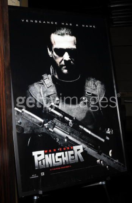
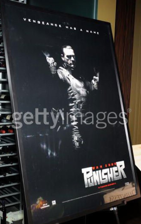
I would have liked to have seen a wake of destruction behind the Punisher in these images. A black background is fine, but a devastated city block is better. I don’t hate these images, the guns do look pretty awesome in black and white, but I do not love these posters either. I am lukewarm in my emotional response to these images.

International friends – what are your thoughts on the posters?

Comment with Facebook

21 thoughts on “Punisher Warzone Posters

  1. i didnt like how the first movie was filmed 99% at the day time. only the last part was at night. it was a good movie but thomas jane isnt the frank castle and it didnt seem lik the punisher at all. but it was a good movie.

    so far this one looks dead on appart from the skull which has already been explained

  2. this guy was pulled right out of the comic book- hes perfect.

    again- i dont like the faded and smaller skull.

    Rodney pointed out that if its big and white then anyone could see him in the dark and thats 100% true but- in the movie you gotta have the visible logo if youre a superhero!

  3. I would say this is one menacing and threatening looking guy. I’m already scared of him just from seeing those posters. Thomas Jane wasn’t scary enough.

  4. I like the first one, it has impact – I particularly enjoy the shadows in the contours of the face inhibiting you from seeing his eyes. but the second one has no emotive impact whatsoever. It just feels far too ‘removed’ from what it’s trying to ‘sell’.

    Again, it’s first impressions, but I am not too keen on this new guy. Thomas Jane was pretty awesome as the Punisher the first time around.

  5. Is anyone else getting really tired of these repetitive “static character” posters? Where’s the violence, the action, the emotion?

    I would have much preferred to see him guns blazing, as in those classic Mike Zeck Punisher comic covers from the mid-80s. Or else dropping a criminal off the side of a roof, or smashing some thug’s face into the ground.

    This new design school of actors striking their tough guy face and brandishing their weapons (GI Joe, X-Men, Hellboy, Dark Knight etc) is extraordinarily shallow thinking. It has the design sensibility of amateur selfshot porn… without ta-tas. And that’s never a good thing.

  6. I would have liked to see Thomas Jane in this, he was good in the first one.

    Is this still considered a sequel or is this another standalone or “one shot” type story? They havent really addressed that too much.

    I might see this in theaters but Im not getting my hopes up, not having Jane back in the lead takes away alot of interest for me.

  7. I think “the new guy” (Ray Stevenson) looks almost exactly like the representation of the Punisher in Marvel’s MAX imprint, which is possibly the most badass comic in the company or, in fact, the entire world. If the movie’s going for that vibe, I will see it fifteen times and then waltz merrily around the planet going door-to-door, rubbing it in the face of everyone who ever doubted Ray Stevenson as a decent Punisher.

  8. William, from one designer to another, I’d have to agree. The first image is much more striking and powerful. The logo is just too big personally and reads like, ‘Punisner’.

    The images do look like a take from some of the more recent comics which is a nice touch.

  9. I don’t like the new guy for Punisher. Too deadpan. It doesn’t seem like they’re doing anything interesting with it – I’m expecting it to suck.

    These posters? Same – nothing too interesting.

  10. I dont like this new guy for castle, why did they get rid of the old one? I thought the old guy was awesome in that role and while the first movie was not great it was not because of the casting of the Punisher.

Leave a Reply