For most moviegoers, the Marvel Studios logo is simply a familiar part of the pre-show experience. The lights dim, the fanfare begins, and clips from previous entries flash across the screen as audiences settle in for the latest MCU adventure. It is an iconic, instantly recognizable tradition. However, Spider-Man: Brand New Day has completely transformed this branding, making the logo a vital part of the upcoming story.
Over the years, the logo has evolved beyond simple corporate identification. Marvel has repeatedly updated it to reflect the state of the franchise, occasionally creating special variants for specific projects. While some changes remain cosmetic, others serve a commemorative purpose, such as the tribute version that debuted following the death of Chadwick Boseman. Spider-Man: Brand New Day takes that evolution a significant step further by turning a piece of franchise branding into an active storytelling device.
A Narrative Tool for Peter Parker
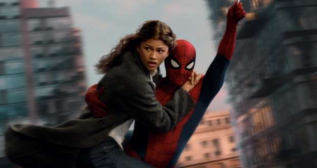
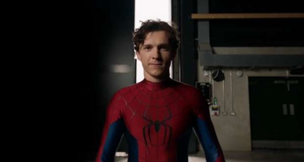
The version of the Marvel Studios logo used in this latest installment immediately stands apart from previous entries because it focuses entirely on the corner of the franchise occupied by Peter Parker. Rather than pulling footage from across the wider cinematic universe, the sequence uses clips specifically connected to his journey. Throughout the sequence, Peter is seen disappearing from familiar scenes from previous films. It is a clever visual representation of the ending of Spider-Man: No Way Home, in which a spell caused the world to forget his existence.
In just a few seconds, the logo reminds audiences where the story left off and communicates the emotional consequences of that ending. Peter has effectively vanished from the memories of the people who once knew him. By integrating this recap into the opening, the film ensures that viewers are reminded that Peter has become a ghost in his own life before the opening scene has even begun.
The Evolution of the Marvel Logo
Marvel’s history with on-screen logos predates the MCU by several years. Although the studio released Blade in 1998, it did not have a dedicated on-screen logo until 2002’s Spider-Man. Created by Imaginary Forces, the famous Flipbook logo became the company’s defining cinematic introduction for nearly two decades. The sequence featured pages from comics rapidly flipping through the frame before forming the familiar branding. Its longevity was remarkable, with versions remaining in use until 2020.
When the MCU launched with Iron Man in 2008, the studio introduced its own version of the Flipbook logo, adding the word Studios beneath the branding. As the franchise grew, the design needed to feel more cinematic. In 2013, the logo was redesigned to expand into a three-dimensional metallic animation. Another major overhaul arrived in 2016 with Doctor Strange, which transitioned from comic-book imagery into artwork and movie footage from the MCU itself. This shift marked the beginning of the logo celebrating the interconnected film franchise rather than just the comics.
The latest development in Spider-Man: Brand New Day demonstrates that even something as familiar as the studio logo can become a meaningful part of the narrative process. It is a significant step for the franchise as it continues to find new ways to connect audiences with its ongoing stories.
Source: ScreenRant