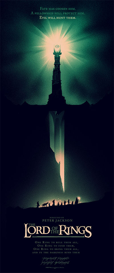
So Elliot showed me this new Mondo poster for the Lord of the Rings and asked me my opinion. What ensued was a nice little back and forth exchange between the two of us assessing and critiquing the poster from a design perspective. I figured I’d try something different for you guys and give you a little taste of that conversation to give some insight on just how frequently the staff of TMB discusses films and provide some insight of our differing perspectives:
Anthony: what did you think of the lotr poster, from a designer point of view.
Elliot: best one mondo has put out in a long ass time, the subtlities are nice… the sword being a cliff, and the tower works well as a hilt. The only gripe I have is there is too much type and it’s not treated perfectly to blend well with the negative space that the visual assets do.
Anthony: The type bothers me too.
Elliot: Slogans are usually just two lines, at best, and they also have.
Anthony: I thought it was neat to include the elvish text.
Elliot: the “one ring” at the bottom, that could’ve been left in elvish… and that’s the easter egg about the poster, the people buying these posters aren’t dumb to not know the slogan.
Anthony: I don’t like the elvish where it is. I get the idea, I just don’t like the placement.
Elliot: so it’s a waste to have it in English and elvish. I would’ve placed “directed by Peter Jackson” elsewhere or removed it altogether. I would’ve also put all the credits at the bottom if that’s the case
Anthony: I don’t understand the necessity of including Jackson’s name. I “get” it, but it takes away.
Elliot: could be a license issue, like they had to put it in. The other problem, to me, is that I should read ‘LOTR’ first, not his name. They could also completely do without the text at the top.
Anthony: I could do without the text period
Elliot: nah you gotta have something at the bottom
Anthony: Sure, it does need an anchor
Elliot: what should’ve happened was the variant should’ve read LOTR in elvish.
Anthony: I woulda put everything in elvish, and left out the English entirely except for maybe the movie title. BTW, their variants suck.
Elliot: Nah that’s too simple. And that’s because the variant is just a different color. you gotta put more type in it.
Anthony: their variants are just color treatment. I get a variant cover to a comic and its typically a completely different cover. I feel jipped.
Elliot: That’s just not how it is right now
Anthony: what would you do to improve the poster?
Elliot: the LOTR type isn’t the original type either, which is another thing I don’t ‘get’. I’d just completely fix the typography. It needs a complete overhaul, otherwise visually the poster/image is perfect. Check this out: http://blog.mondotees.com/2012/12/12/olly-moss-the-lord-of-the-rings-detail-shots/)
See how the type is too tight at the top?
Anthony: that link is dead for me
Elliot: ah too bad
Anthony: no worries, i got the google cache
Anthony: I did not notice smeegal in there
Elliot: yeah dude. I told you, subtleties.
Anthony: gotcha
Elliot: hmm… maybe that is the O.G. LOTR text…
Anthony: I think i might actually do it. I think i might just copy and paste our convo
Elliot: fix my typos.
Anthony: I can’t even fix my own!
Elliot: that poster though. Visually it’s PERFECT symbology of the movie. That’s how nailed it is, Olly Moss did a great job. I still think mondo needs to hire typographers, or graphic designers to layout the posters. These cats are great artists first.
Via: Latino Review
